- Fresh Fonts
- Posts
- 119 / Pump up the volume 🔊🔊🔊
119 / Pump up the volume 🔊🔊🔊
Your monthly selection of hot new fonts.
Noemi Stauffer
November 6th, 2025
Hello everyone 👋
And welcome back! Today’s issue has an unexpected musical note running through it—several of the featured fonts were used in music-related projects or show a certain rhythmic quality in their design, that sense of movement you might associate with sound. And as usual, there is a free font to download near the end of the email. I hope you enjoy it!
✌️ Noemi

Typeface of the Month
A hand-picked professional typeface for just $19.99. Exclusively for Premium Members.

DaVinci in use on the cover of rīvus – A Glossary of Water, a book designed by Zolo Press with many collaborators for the 23rd Biennale of Sydney. Click on the image to view the project.

DaVinci in use on the cover of rīvus – A Glossary of Water, a book designed by Zolo Press with many collaborators for the 23rd Biennale of Sydney. Click on the image to view the project.

DaVinci Italic, including ligatures and swash alternates, in use on a poster designed by Sophia Krayc for Reflectors Hub. It is paired with Swiss Int’l from Swiss Typefaces and its monospaced counterpart. Click on the image to view the project.
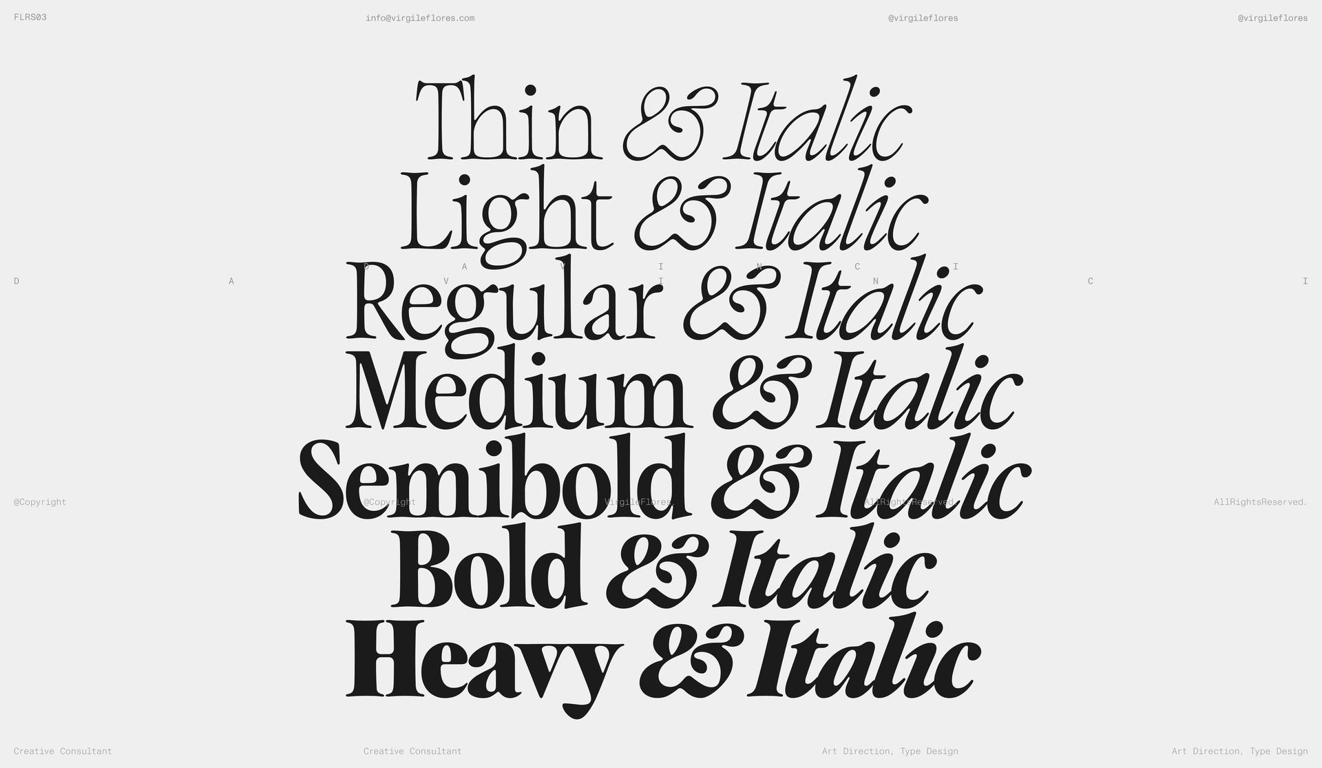
DaVinci by Virgile Flores
DaVinci was recently updated with italic styles, and they were absolutely worth the wait, featuring many swash alternates. “I can’t believe it took me six years to finally complete the full DaVinci family,” says designer Virgile Flores, a NYC-based creative working at the intersection of fashion, art, and music. These influences are visible throughout the typeface, with glyphs flowing gracefully into one another to create dynamic movement.
On several characters, you’ll notice that the serifs touch and connect—sometimes at the top, sometimes at the baseline. Even subtle details reveal careful attention: the dots on the ‘i’ appear slightly oversized in thin weights, then becomes proportionate as the weight increases, adding to DaVinci’s playful character. The typeface comes in seven weights with matching italics, offering a wide range of ligatures and four sets of numerals (proportional, lining, tabular, and oldstyle), making it as functional as it is pleasing to look at.
For a limited time, get DaVinci when you upgrade to Premium.
What you’ll get:
🎨 The complete DaVinci font family
The complete DaVinci font family: 7 weights + matching italics
Formats: Desktop fonts (TTF) + Web fonts (WOFF)
Keep and use the fonts forever: even after you cancel your membership
🤝 Full Commercial License
For a company size of maximum 5 employees (including yourself)
Use in: personal and commercial projects (non-transferable to clients)
Desktop use: for unlimited users/computers within your company
Web use: on one domain, without limitations on traffic/visitors
👯♀️ Suggested Font Pairings
Our curated recommendations of fonts to pair DaVinci with
You missed DaVinci at $19.99!
Sign up for our newsletter so you don’t miss the next special offer.

Fresh Releases


Innovator Grotesk from Yep! Type Foundry
At first glance, Innovator Grotesk looks just like another grotesque. But it’s got much more under the hood: a special set of icons and UI symbols adjusted in weight and size, currency symbols that were optically adjusted to perfectly align with numerals, and different stylistic sets, including one that improves legibility by making certain letters easier to differentiate. The typeface comes in nine weights with italics and works remarkably well at small sizes. If you’re not convinced yet, the pricing might do it—commercial licenses for companies of up to 5 employees cost only $10 per font style.


Speaker from Formula Type
Speaker is the latest from Formula Type, a type foundry run by Piero Di Biase out of Udine, Italy. Designed by Piero himself with technical support from Alberto Malossi, this retro-futurist typeface evokes dot matrices and flip-dot displays. The family includes three cuts: a Regular weight, its monospaced counterpart, and a Mono Screen cut built on a 7×7 dot grid. Perhaps the best part—the typeface includes 400 symbols and emoticons that are pure joy to look at!

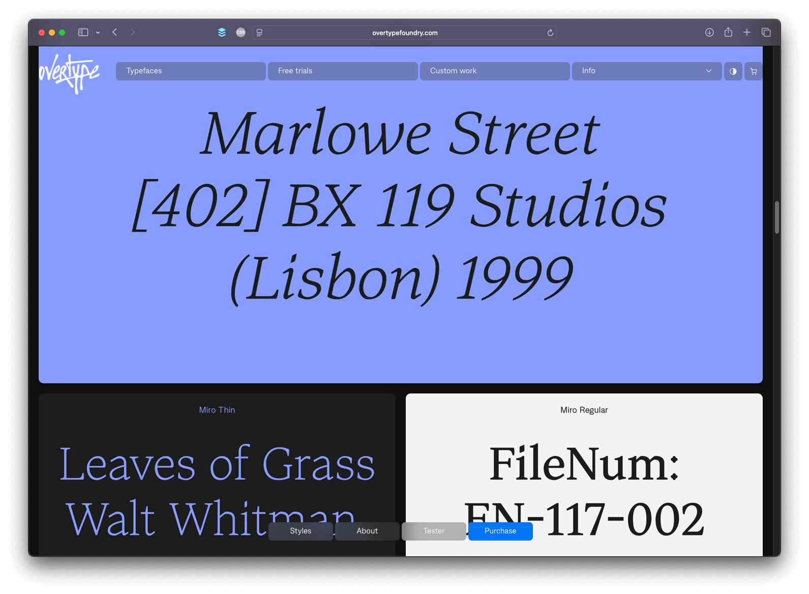
Miro from Overtype Foundry
New foundry alert! Overtype is the new independent type foundry of Inès Davodeau and Tim Vanhille. The website launched with a starting catalogue that includes two retail typefaces: a serif and a sans-serif. My preference goes to the serif, Miro, which combines classic elegance with a raw, expressive edge—featuring subtle breaks and distinctive details that give it personality and depth. Miro is a great choice for long-form text, editorial projects, and striking logotypes.


Yuni Grotesque from TypeMates
Designed by Philipp Neumeyer and released through TypeMate, Yuni Grotesque is the new addition to the Yuni collection, which already includes Yuni Slab. Yuni Grotesque pairs compressed, high-impact shapes with mischievous, functional curves—counters that round as weight increases. It comes in six weights ranging from Hair to Black, with an expressive 18° italic that has real personality, making it a practical choice for bold headlines, branding, and global UI work.

Free Font of the Month
One of the free fonts shared in the last 🔒 Member-exclusive issue 🔒 of the newsletter.

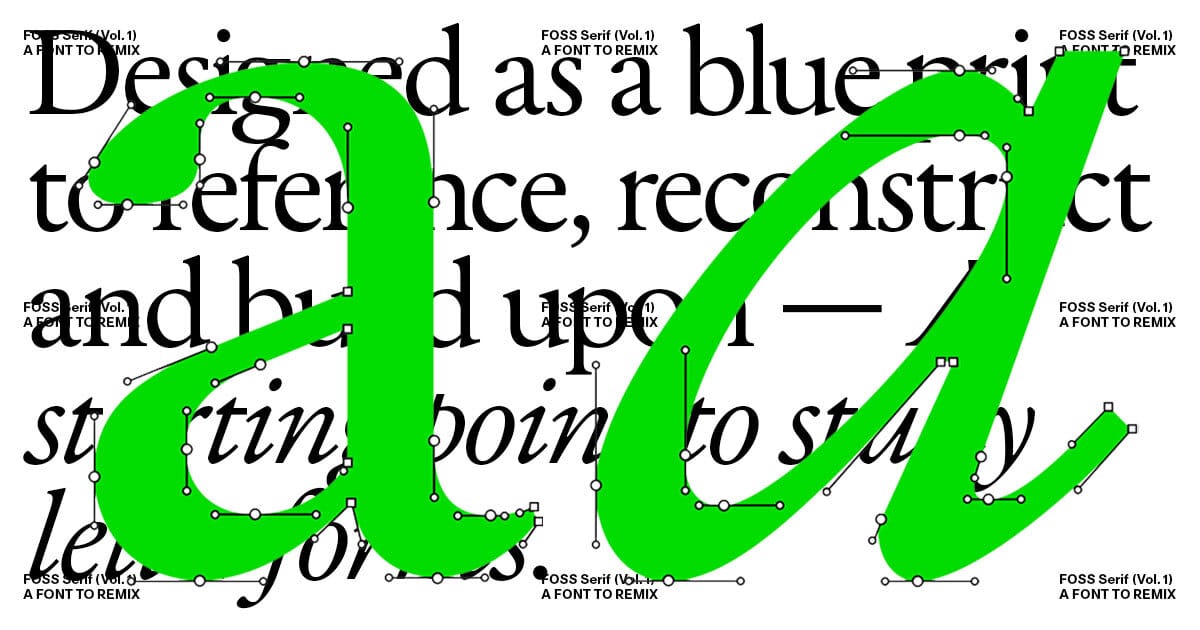
FOSS Serif from Boulevard LAB
FOSS Serif is the first typeface released by FOSS Projects, a new initiative by type foundry Boulevard LAB that currently offers an affordable course on type design. Designed by Samuel Glen Hughes, FOSS Serif comes in a single Regular style, though an italic counterpart is expected soon. The typeface was made open-source to serve as a learning tool—students can study its letterforms, spacing, and structure while modifying and expanding upon it. Additionally, anyone can submit modified or expanded versions to [email protected]. Selected “remixes” will be included in future open-source releases with full designer credits. We can therefore expect to see some cool derivative works very soon!
FOSS Serif is free for both personal and commercial use.
☑️ By downloading the font, you consent to receiving emails from Fresh Fonts and FOSS Projects.

Goods

The Ohno Book, published by OH no Type Co., is now shipping. It features type specimens, process sketches, and instructions for creating typefaces.

The Atlanta sweatshirt, set in Colophon’s Coign typeface, is back in stock on the webshop of Walker Carney.