- Fresh Fonts
- Posts
- 117 / Your shortcut to hidden gems 💎
117 / Your shortcut to hidden gems 💎
Your monthly selection of hot new fonts.
Noemi Stauffer
September 4th, 2025
Hi everyone 👋
Hope the transition back to work has been gentle. Here are some wonderful new typefaces from the past month to inspire your upcoming projects!
✌️ Noemi

Typeface of the Month
A hand-picked professional typeface for just $19.99. Exclusively for Premium Members.
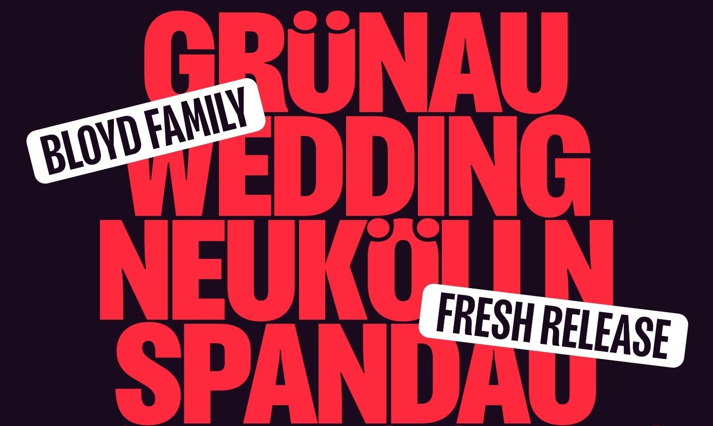
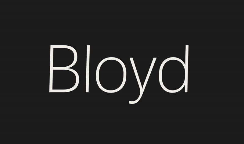

Bloyd from Ligature Type
You might be familiar with the work of Ligature Type, who brought us the amazing Easy Grotesk, our Typeface of the Month from April 2024. The Berlin-based duo returns with a new catchy grotesque designed for both headlines and body text. Called Bloyd, the typeface pays homage to magazine titles of the early 1980s. Bloyd is available in three widths, of which Fresh Fonts members are receiving the Normal width—the most versatile of the three, with generous proportions that ensure excellent readability for longer texts. Each width includes eight weight, ranging from ExtraLight to Black, with matching italics and a variable font version. Additionally, Bloyd is packed with OpenType features, including symbols, arrows, and an extensive array of stylistic alternates that offer playful variety. The perfect addition to your design toolkit!
For a limited time, get Bloyd when you upgrade to Premium.
What you’ll get:
🎨 The complete Normal width
Bloyd (normal width): 8 weights + italics + variable font
Formats: Desktop fonts (OTF) + Web fonts (WOFF2) + Variable fonts (TTF, WOFF2)
Keep and use the fonts forever: even after you cancel your membership
🤝 Full Commercial License
For a company size of maximum 5 employees (including yourself)
Use in logos and wordmarks is allowed (modification of the font is not)
Desktop use: for unlimited users/computers within your company
Web use: on one website (no traffic restrictions)
👯♀️ Suggested Font Pairings
Our curated recommendations of fonts to pair Bloyd with
You missed Bloyd at $19.99!
Sign up for our newsletter so you don’t miss the next special offer.

Fresh Releases


Almandin from typographies.fr
French designers Laurent Bourcellier and Jonathan Fabreguettes present Almandin, a thoughtfully crafted sans-serif that took nine years to perfect. This collaborative project reflects the designers’ training at École Estienne, resulting in a typeface that balances neutrality with calligraphic influence. In addition, Almandin is uniwidth (also known as multiplexed), meaning that character width remains consistent across all seven weights—ensuring seamless alignment when mixing different weights in the same layout.

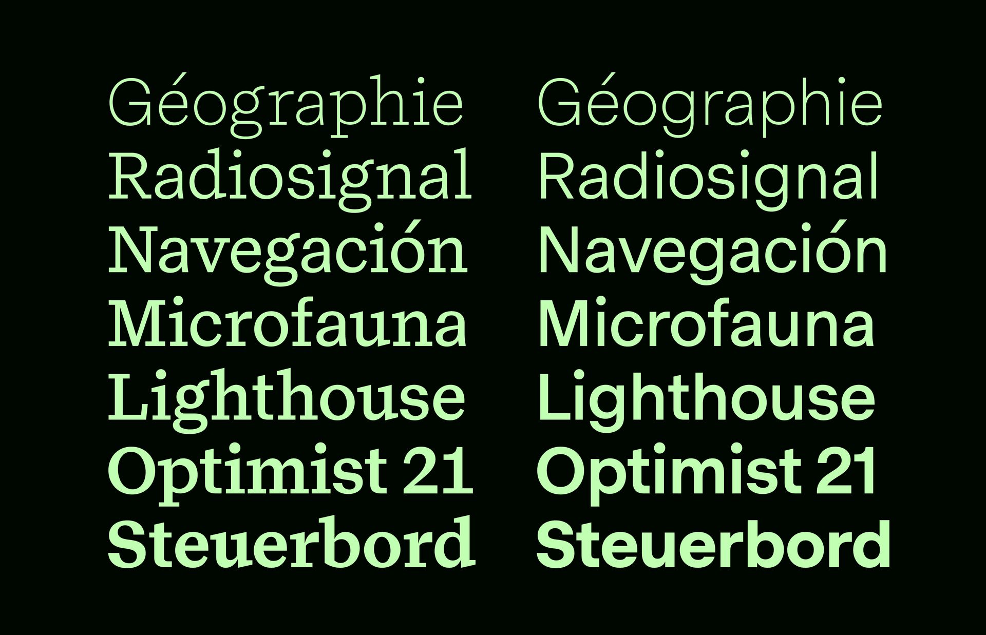
Yetson from Luzi Type
Swiss foundry Luzi Type released Yetson, a family that includes both a Serif and a Sans-Serif version. “It’s satisfying for me to observe how seamlessly the French Renaissance Grotesque harmonizes with its sans-serif counterpart” explains designer Luzi Gantenbein. In addition, the two families share the same design foundation, making them perfect companions for use in complex typographic hierarchies. Both subfamilies come in eight weights, ranging from Light to Black, with matching italics.

Tausend from Fontwerk
One of the biggest and hottest releases of the summer, Tausend is an extensive superfamily in the tradition of German grotesques. Designed by Christoph Koeberlin and Gabriel Richter, Tausend includes six families. At its core is the “classic” Tausend family, which also exists as Tausend Plakat—an optical size optimized for larger display applications. Tausend Soft features discreetly rounded corners and is available in two optical sizes as well. Beyond the Stencil family, you’ll find Tausend Shaded, the most interesting subfamily, at least technically speaking. Tausend Shaded offers nine weights with shadows that adapt visually to each weight, and in its variable font version, the shadows adjust dynamically as you increase the font weight. Developing it was “one of the biggest challenges in my professional career,” explains Gabriel Richter.
🎁 The Base License tier for the Tausend Shaded subfamily is free!


BAZAAR from Letters from Sweden
Designed by Laurette Colmard, a type designer based in Grenoble, France—who also graduated from École Estienne in Paris, just like the designers of Almandin featured above—BAZAAR draws inspiration from graffiti and street writing. Its letters, varying in height and dancing around rather than sitting on the baseline, are set extremely tight to create a wild and fierce rhythm, particularly striking in all-caps settings. But the best part for me is the set of hand-drawn icons, that are also variable 😍

Free Fresh Font
One of the free fonts shared in the last 🔒 Member-exclusive issue 🔒 of the newsletter.
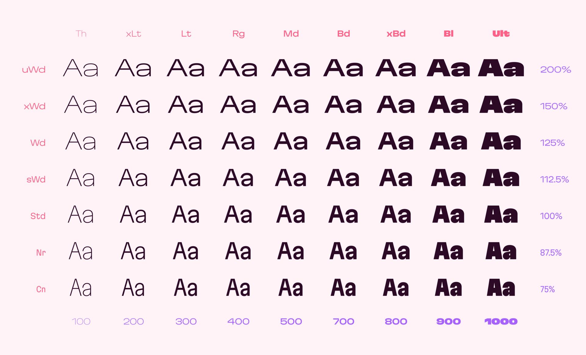
Martian Grotesk from Evil Martians
Martian Grotesk, the big brother of Martian Mono, was recently made open source. The entire family, which previously sold for over $1,000, includes 63 static styles spanning nine weights (from Thin to Ultra) across seven widths (from Condensed to Ultra Wide). It’s also available as a variable font with two axes (weight and width). With its distinctive character, Martian Grotesk includes features that make it an excellent choice for use on the web. For instance, the typeface’s vertical metrics guarantee equal space above and below text, enabling text labels to be positioned evenly on buttons. Martian Grotesk can be downloaded from GitHub and the Evil Martians website.
Note: The fonts are already compiled and available for download in OTF, TTF, and WOFF2 formats. To download the fonts, visit the GitHub repository (on desktop) then click the green <> Code button and select Download ZIP.

Goods

I like these color-edged notepads from WMS&CO. Available in various sizes and colors.

Refresh your wardrobe with a stylish cap from Dinamo.