- Fresh Fonts
- Posts
- 120 / Script fonts you’ll want to use 😍
120 / Script fonts you’ll want to use 😍
Your monthly selection of hot new fonts.
Noemi Stauffer
November 18th, 2025
Hello everyone 👋
And welcome back! I don’t share many script fonts in this newsletter—it’s true, I’m very picky when it comes to the genre. For some reason, I tend to find them a bit tacky. But today’s issue features two new script fonts that I couldn’t resist sharing, ones I would actually love to use myself. I hope you enjoy them! And as always, if you have comments or feedback, just hit reply—I read and respond to every email.
✌️ Noemi

Foundry Spotlight
Paso typeface
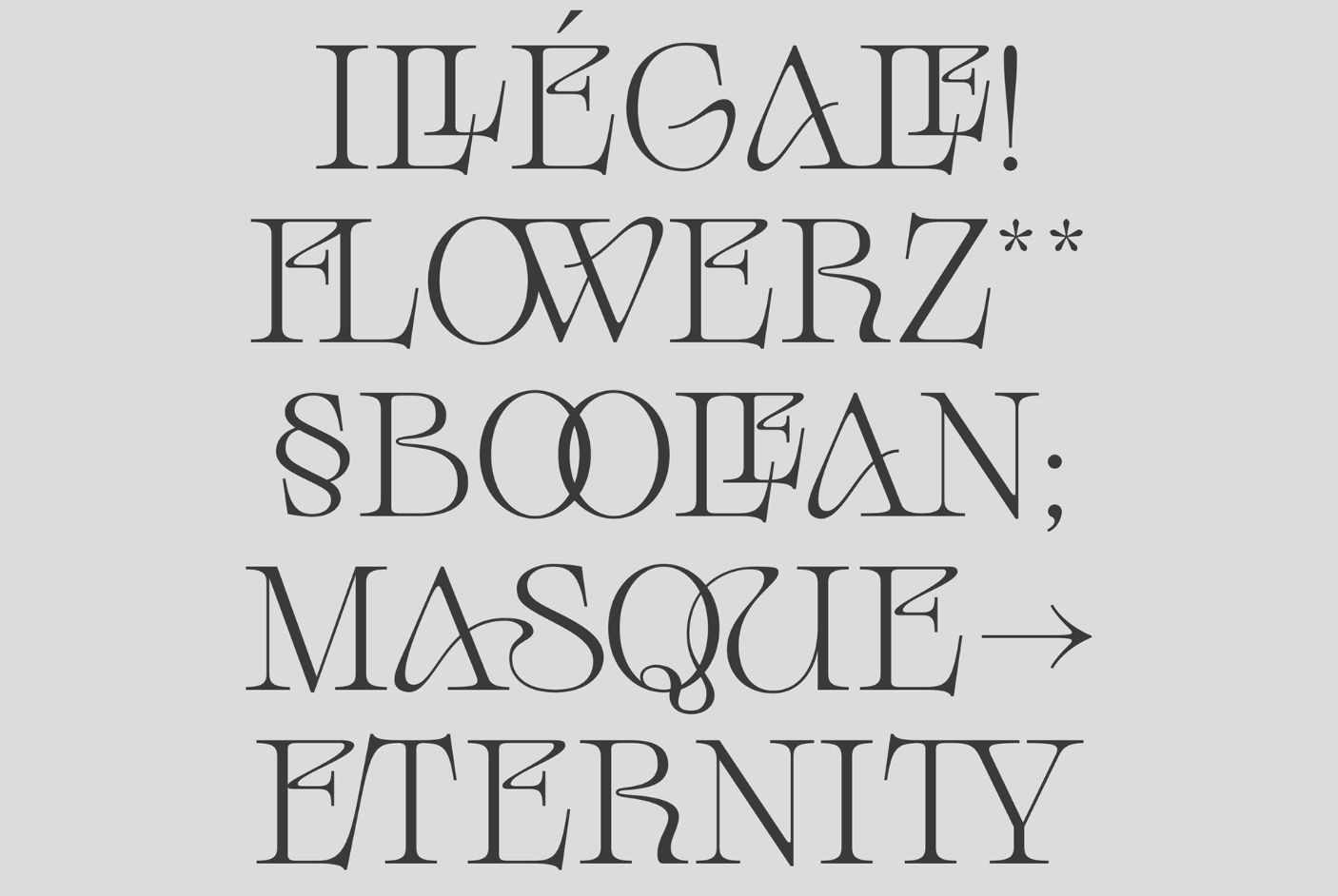
Hard Nouveau typeface
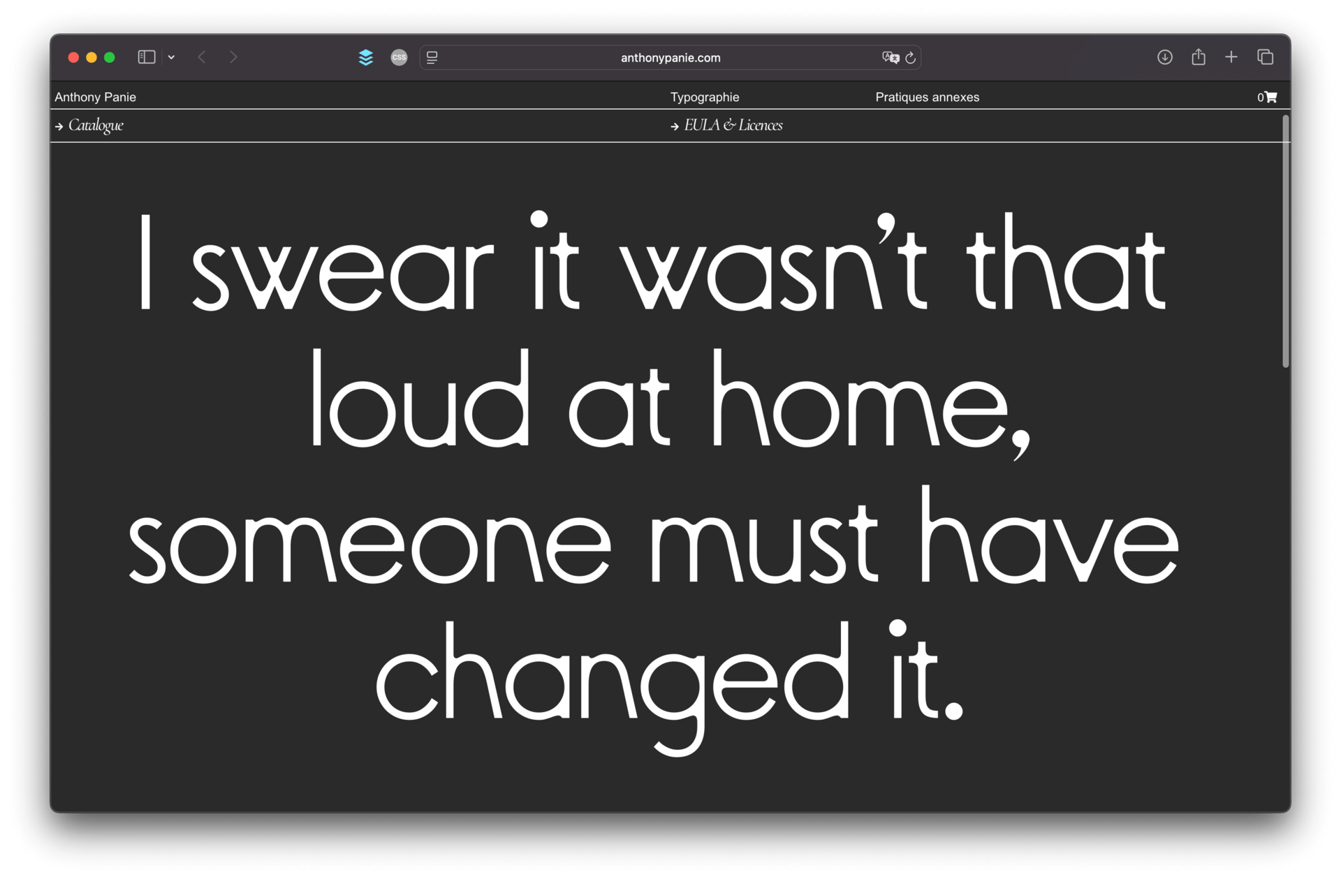
Anthony Panie 🇫🇷
Montpellier-based designer Anthony Panie just launched his own independent type foundry. The starting catalogue includes four retail typefaces, of which Paso is probably my favorite. Originally designed for the precision of architectural plans, Paso is a geometric sans-serif well-suited for contemporary interfaces. But make sure to have a look at Hard Nouveau as well, a display typeface with extravagant letterforms and ligatures, and Marthe Mono, a monospaced typeface with plenty of personality.

Fresh Releases

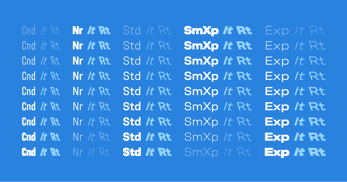
Unifora from Yep! Type Foundry
Portuguese foundry Yep! Type released Unifora, a massive type family in five widths: Condensed, Narrow, Standard, Semi-Expanded, and Expanded. Each width includes nine weights from Thin to Black, with matching italics and even backslanted styles (retalics). In addition, each width is uniwidth, meaning that characters occupy the same horizontal space across all font styles. This makes Unifora a great pick for animation and UI design. Note that the current version only includes a basic character set—which is why each font style starts at just $5—and by licensing it now, you’ll receive the future update free of charge when it’s released very soon. Don’t sleep on this one!


Pennline Script from The Northern Block
Pennline Script is a beautiful revival of Bulletin, a typeface first cast in the late 1890s by the Keystone Type Foundry in Philadelphia, USA. Designer Tasos Varipatis carefully redrew and rebalanced every glyph to preserve the expressive irregularity of the original design—you can see images of the original source material and read more about the design process on the foundry’s blog. Despite its historical roots, no compromises were made on OpenType features, which include various alternates, ligatures, and eight stylistic sets. Available in a single Regular style, Pennline Script is a powerful tool for designers seeking both aesthetic charm and practical flexibility.
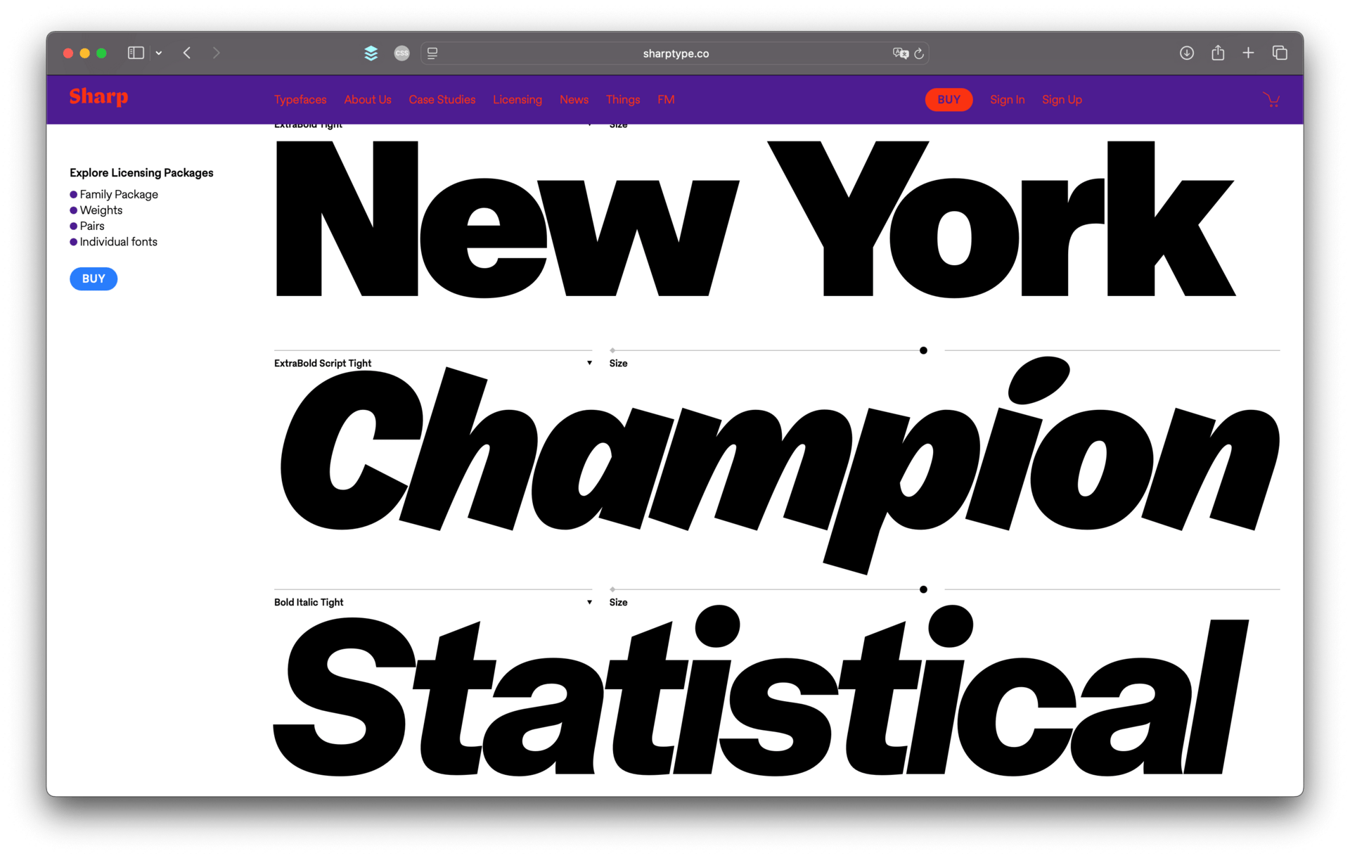
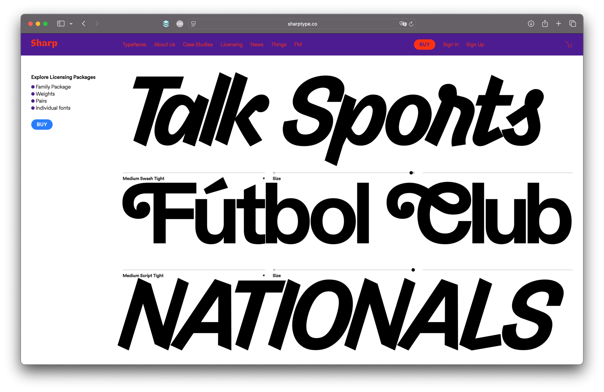
Rotina from Sharp Type
A collaboration between Nuform Type and Sharp Type, Rotina is a neo-grotesque collection in three families. At its core, the standard Rotina family is a versatile and reliable sans-serif, available in eight weights plus matching italics. The second family, Rotina Swash, features beautiful swash uppercase characters and many swash alternates for lowercase as well. Lastly, Rotina Script is a bold, handstyle-inspired family designed to provide emphasis beyond a traditional italic. To top it all off, every font style in the family is also available in a Tight variant—with satisfyingly tight letter spacing—that works beautifully at large sizes.
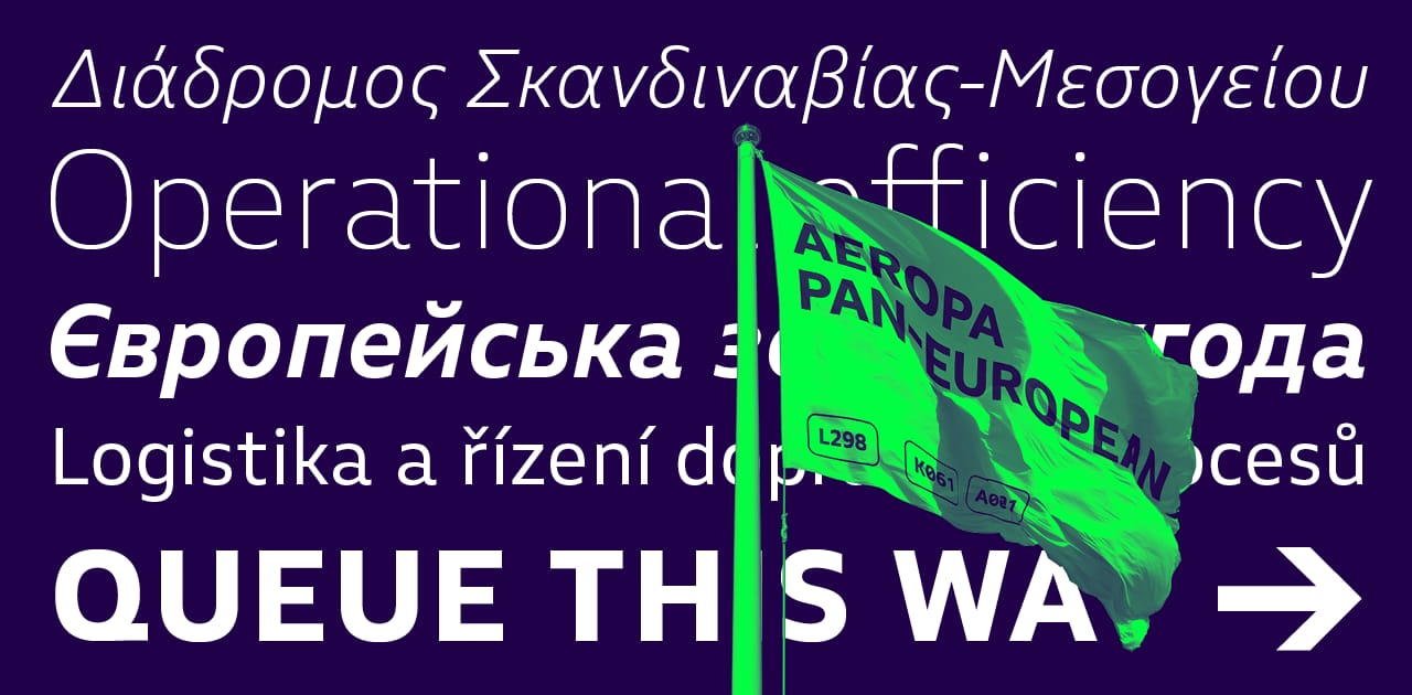
Aeropa Pan-European from Rosetta Type
Rosetta Type released Aeropa Pan-European (PE), a humanist sans-serif designed to thrive in compact, information-dense settings. The typeface is available in six weights with matching italics, plus as a variable font with two axes of variation (weight and slant). Additionally, the italics share the same width as the uprights, allowing you to easily swap one for the other without causing text to reflow. Complete with support for Latin, Greek, and Cyrillic scripts, Aeropa includes over 450 alternate glyphs that let you customize its appearance—choose between circular or square dots, cursive or constructed forms in Greek, and many more options.

Free Fresh Font
One of the free fonts shared in the last 🔒 Member-exclusive issue 🔒 of the newsletter.

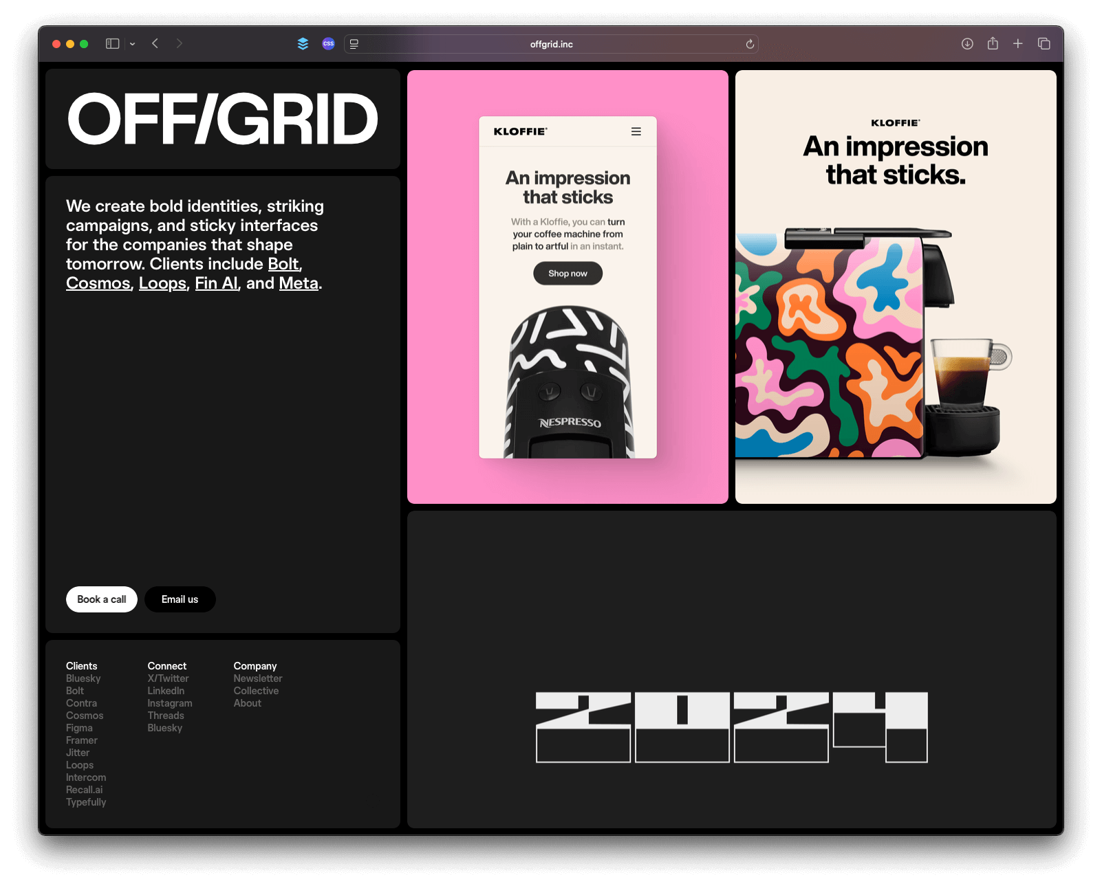
Offgrid Sans by Fons Mans
I stumbled upon Offgrid Sans, a collaboration between Rotterdam-based designer Fons Mans and type designer Nicolas Massi. The design is based on the ever-popular Inter typeface by Rasmus Andersson, but with some subtle differences—most notable are the square punctuation marks and diacritics, which are round in Inter. Offgrid Sans comes in nine weights (without italics) and can be seen in use on the website of Offgrid, Fons Mans’ graphic design studio. The typeface includes several alternates, such as the alternate ‘R’ and ‘G’ that appear in the studio’s wordmark pictured above.
Offgrid Sans is free for both personal and commercial use.

Goods
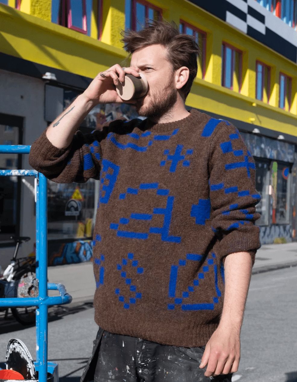
The Keith Sweater is now available from Or Type Foundry. This limited-edition sweater is made from 100% Icelandic wool and features Keith—an unreleased variable pixel typeface.

Logitech launched the MX Master 4 mouse. It includes a new button with haptic feedback that opens a menu with quick actions tailored to the app you have open (Figma, for example). Coming from the Apple Magic Mouse, it’s more comfortable and ergonomic, although it does require a bit of getting used to. But once you’ve found your ideal setup (I made the thumb wheel switch between desktops), there’s no going back. Plus, I can finally use my mouse while charging it 😅